
Article
Better Web Design for Graphic Designers

PUBLISHED:March 11, 2022
UPDATED:September 6, 2024
We love working with graphic designers and design agencies. Being a part of the creative process and enabling a design team to bring their vision to life for their clients can be as rewarding as designing a website yourself.
Over the years, both LWDA and our sister agency Devstars have built solid relationships with graphic design agencies such as Mystery and Salad, delivering website solutions for a broad range of clients. And as a part of those relationships, we’ve helped guide their graphic designers toward being better web designers.
That last part was very important to mention. Why? Well, not all design disciplines are the same. Many require unique extensive training and experience to master.
Take Philippe Starck for example; and his 1995 attempt at designing a motorcycle. As Visordown put it “Aprilia commissioned French avant-garde designer of the ’90s, Philippe Starck, to design a motorcycle. What they got was a crime against motorcycling.”
Working with design agencies to build great websites
Over the years I’ve worked for both branding agencies and web design agencies, seeing many portfolios from graphic designers looking to work in web design. These designers have a lot of creative talent, but they tend to lack a true understanding of web design and what it takes to create a usable website that works responsively across desktop & mobile devices.
It’s just not enough to create some nice visuals in Photoshop, add them to your portfolio and start applying for web design positions.
So, with this in mind, we thought we’d put together a list of tips aimed at graphic designers who want to be better web designers.
Ladies & Gentlemen, this is our Guide to Web Design for Graphic Designers.
1 – Sketch first. Design later.
When starting a new web design project, it’s all too easy to just dive straight into Photoshop or Figma without thinking about the structure of the page or the site as a whole. Our advice is to resist this temptation and spend some time with a pen and paper, mapping the site and each page template.
Think about the content of the site and how many pages might be required. Use this to plan your navigation and the structure of each of your pages.
Sketch where each element might be placed on the screen. Think about the size of these elements and their relationship to each other. This process will give you a good feel for the site as a whole and the user journey.
2 – Design to a grid
Now, we’re not advocating a boring boxy layout with this statement, but designing to some sort of grid is essential to understanding responsive web design.
In fact, we suggest taking a ‘mobile-first’ approach to designing websites. Considering how the website will look on smartphones first, then upscaling for tablets & desktops (including laptops).
Far too many times we’ve seen home page designs for the largest of screens, and immediately wondered how on Earth the designs would work on mobile.
The problem is that we designers are so used to the luxury of working on big iMac screens, that we forget many users will be browsing sites on much smaller devices.
Combine this with the fact that most graphic designers are used to working on print-based projects which design to fixed page sizes, and the concept of producing an adaptive design rarely comes to mind.
The trick here is to consider Editorial Design. Look at how the best newspapers and magazines layout their pages and then imagine those are web pages. How would each column and element rearrange themselves if the browser window was made smaller?
Editorial design is another design discipline that takes time to master, but there are some great books and resources out there which cover the basics and will help you think about the structure of your web pages in a different way.
You can also look up articles about grid systems as well.
3 – Determine Information Hierarchy
Referencing editorial design also helps a designer understand information hierarchy. A key skill when it comes to structuring websites and web pages.
Information hierarchy is all about giving the page content a logical structure that is easy for the eye to track though. The aim is to help users digest the information on the page with ease.
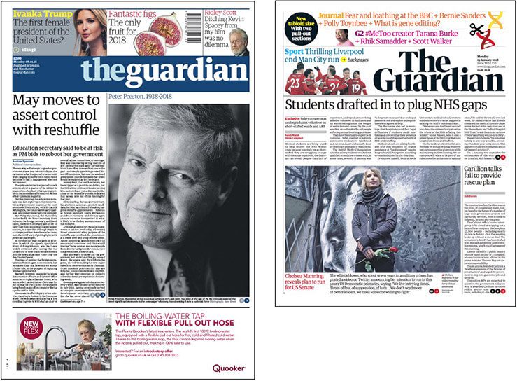
When looking at a newspaper’s front page, especially one as well designed as The Guardian, you’ll notice how easy it is for the eye to track across the page and focus on key pieces of information.
From the masthead through to the main story and down to smaller highlighted stories, each element has been considered carefully in terms of colour, size and placement. The same approach should be applied to web pages.
Section Headings
At this point, I would like to highlight one key element that contributes to a good information hierarchy, which is the size of the font used for section headings.
Page headings & section headings are specified within HTML using the <h#> tag where # is a number, usually from 1 through to 6. The main title of a page is the <h1> tag and then each subheading on that page will use a higher number. There is only ever one h1 tag on a page, but there can be many h2, h3 and h4 tags, etc.
The H1 tag is usually the biggest title on the page, with each heading that follows being displayed slightly smaller so that the user understands the importance of the heading within the hierarchy of the article they are reading.
It’s very important to be consistent with the size of your headings. Do not change the font size for your headings from page to page. And that should also apply to your body copy too unless there is a good reason to change it.
So when you are visualising your website, consider the size, colour and font weight for each of the following items and stick to those values throughout all of the pages you visualise.
Text elements to style consistently in your web designs
- The <h1> tag – The main page heading
- Subheading tags – <h2>, <h3>, etc
- Body text – Content paragraphs
- Pull Quotes – Highlighted text that is often wrapped in quotation marks
- Testimonials – Reviews and praise from clients and customers
- Bullet lists & numbered lists – Usually treated the same as body text, but sometimes with different colour bullet points or numbers
- Breadcrumb trail – A navigation device that helps prevent the user from getting lost on big websites
- Button text – The call-to-action that drives engagement and directs users to deeper content, contact forms or other key tasks
Consistency with your headings and other text elements will help you structure your pages well and create content that users feel comfortable reading.
4 – Web Fonts are not just any fonts
Every designer loves fonts. In fact, you can never have enough fonts to choose from, am I right? The trick is choosing the right fonts for the job.
Be it a corporate client or a project which requires typography with a bit more flair, typeface selection is a key part of any job.
This is also true for websites, but unlike print-based projects, you can’t just choose any font from any source. You need to consider your font selection carefully and where you obtain the fonts themselves.
Very often the font choice will be dictated by the client’s brand guidelines, with fonts being used in print needing to be matched online. In this instance, it’s a case of finding a web fonts service that has these fonts available. If these fonts are not available, then an alternative will need to be discussed with the client.
There are two main sources of web fonts that most designers will likely have access to. Adobe Fonts and Google Fonts.
Adobe Fonts
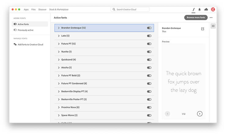
If you already have an Adobe Creative Cloud license, you’ll have access to Adobe Fonts via the Creative Cloud app.
Simply open the app, select Manage Fonts from the left-hand menu and click the ‘Browse more fonts’ button to open the Adobe Fonts website.
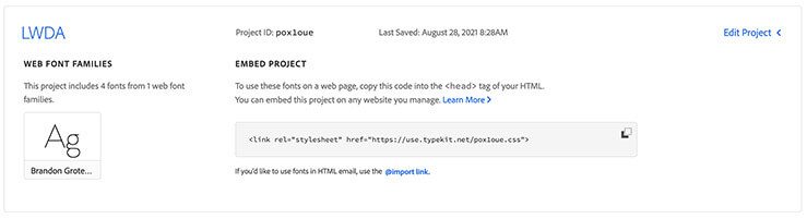
When viewing fonts online, you’ll see an option to add the font to a web project. Use this as a way of building a library of fonts that you will be using for that website.
When you have finished your designs, you can share the embed code with your web developer. They will use this code to import the fonts from Adobe directly into the website.
Google Fonts
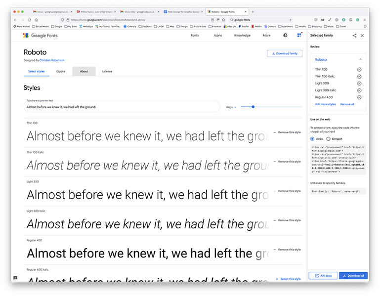
There’s probably not a designer on the planet who’s not aware of Google Fonts. A resource that doesn’t require a special license and is available to use for free in print and online.
The premise is quite similar to Adobe Fonts. You select the fonts you require for your project and then share the resulting code with your website developers.
The key difference is that you need to download the fonts onto your machine and install them before you can begin designing with them, whereas the Adobe Fonts setup manages this process via the Creative Cloud app.
If you don’t use one of the Adobe apps to design your websites and prefer to use a tool such as Figma, you can import fonts from Google and other sources. The process is a little fiddly and you will need to make sure that you tell your web designers which fonts you are using and where you have obtained them so they can get copies for themselves.
The final point here is that any fonts obtained from a service that requires payment will likely incur extra costs for the design agency or the client. Keep this in mind and use it as a reason to source free fonts from Google or Adobe if you have a Creative Cloud licence.
5 – Design for Accessibility
I think it’s fair to say that many graphic designers are relatively young, which means they have great eyesight. They are capable of distinguishing between the most subtle shifts in colour and reading the smallest of text (we know you love your 3pt Helvetica!). The problem here is that many web users have a visual impairment which makes using some websites quite tricky.
The web should be open to all, including those with disabilities. So we need to take care to make our websites as accessible as possible.
Accessibility is becoming more important than ever as we move towards a more tolerant society. So much so that website accessibility is now considered by many to be a crucial part of SEO.
What is website accessibility?
Website accessibility is defined by a detailed set of guidelines published by the World Wide Web Consortium’s (W3C) Web Accessibility Initiative (WAI). The Web Content Accessibility Guidelines (WCAG) 2.1 provide recommendations for making Web content more accessible.
As web developers, we take care of the technical side of things, but designers should be particularly aware of the visual aspects. These are outlined in the section titled 1.4 Distinguishable over at w3.org.
Take particular notice of rules regarding colour, contrast, font size, line & letter spacing, and images of text.
6 – Less is more
Restraint is often the key to effective web design. This means resisting the temptation to add buttons and banners that distract the user from what they are trying to achieve on the site.
Your job as a web designer is to help guide the user through the website in such a way that they feel at ease with the experience. Never lost and never struggling to find content or perform the task they are there to do.
Have a good look around at some of the biggest and best brands to see what they do. Consider the likes of Apple who are famed for following the ‘Less is more’ approach to design.
Our top 5 web design tips are as follows:
- Include a decent amount of space between each element. This helps the eye track from one item to the other and reduces visual noise.
- Make sure that each button (aka CTA aka call-to-action) stands out clearly in terms of size and colour. Buttons need to be obvious and the user needs to understand what is going to happen when they click.
- Reduce clutter within the navigation. Only include the most important links at the top of the page, with the rest being relegated to the footer.
- Try to get the crucial information ‘above the fold’. This is to say at least one good line of text and a strong CTA should be viewable as soon as the user lands on the page.
- Not too much text! People generally dislike reading lots of text on the screen. Be succinct with your messaging and get to the point quickly.
In conclusion
Web design is a unique discipline with its own set of guidelines that should be followed in order to produce a site that is both a pleasure to use and a pleasure to look at.
If you’re a graphic designer that’s been asked to design a website, you can always look at the vast array of template systems that are available. The downside of these solutions is they all tend to produce websites that look very similar to one another, lacking the uniqueness that your client may require.
In order to deliver something truly special for your client, a fully bespoke web design solution is the way to go. You’ll just need to brush up on your skills first.
Once you have your design in place, you can engage a web development agency to help you build the site. In fact, it’s wise to start this relationship as early as possible so they can help keep your client happy throughout the entire process.
This relationship can then be leveraged to help win more web design work from your existing clients. After all, who doesn’t want a chance to grow their business?
Web Design for Graphic Designers: Additional Reading
We hope you enjoyed this article on Better Web Design for Graphic Designers. If so, you may also find these posts useful:
- The Importance of Great Branding for a New Website
- The Importance of User Experience in Website Design
If you are a graphic design agency looking to build a strong relationship with a professional web development agency, feel free to get in touch.
We’re always happy to discuss new opportunities, make new connections and help grow your business in the process.
Do you need a web developer?